To every business, sales are everything. However, small shops have to work harder to compete with the big names if they are to stay afloat in the world of retail. If you don’t have what your customers are looking for, then you may find yourself struggling to get those all-important sales.
A retail fit-out could transform your shop and a customer’s experience, helping them find exactly what they need without spending time searching the shelves and asking for assistance. Having an organised, easy to navigate space will help your customers more than you think, giving them the positive experience they will remember and encouraging them to return again and again.
Find the right shop fit-out for you
There are a range of options to suit your space and your customers’ needs in terms of shop layout. Knowing what will work best for you is the first step to success and keeping your customers happy.
Free-flow
Usually, a free-flow shop layout would mean a customer could browse where they want, when they want, and there is no defined pattern or direction to follow when shopping. Angled shelving and open spaces are used to make customer browsing as simple as possible.
This type of layout can provide a little more space and room for creativity within a shop, but it’s important to keep customer behaviours in mind. Think about the types of products that go well together and stock these closeby to encourage customers to make additional purchases. Free-flow layouts are great for smaller spaces, and with the current social distancing measures, they could help customers feel safer when shopping.
Loop/race track
The loop or racetrack layout is a way of encouraging your customers to take a specific path through your shop in a one-way style system. This closed loop style takes customers on a tour of the shop, ensuring they walk past every section of products before they reach a check-out.
This layout is great for maximum product exposure, and can help to boost sales on those impulse purchases. Promotions can be carefully placed along the customer’s journey and you can guarantee these will be seen with the right labelling. However, with this type of layout, customers don’t get a say in the areas they want to browse, and could become a turn-off for them. Weigh up your options and consider the size of your shop before opting for a loop layout.
Grid
The grid layout is the basic layout you’d naturally see in a lot of stores, a layout that predicts the shopping patterns of the customer. Not only does the grid layout maximise the amount of products you can have on display, but it also minimises the amount of clear space that could be used more effectively.
Many stores use this layout to their advantage by stocking every day items such as milk and bread at the far end of their stores, ensuring that their customers walk past a range of other products that could potentially become impulse buys. It’s a familiar layout for many customers and gives your products more exposure compared to other layouts.
Herringbone
Similar to the grid, the Herringbone layout is good for longer, narrow shops, especially those with limited space available. It can prevent your shop looking cluttered and unwelcoming, but there can be a few disadvantages to consider.
With many areas hidden and one main aisle section, it could be the perfect opportunity for shoplifters, meaning you’d need added security or CCTV. Some customers may also feel cramped, so it’s important to consider some empty spaces to give your customers some breathing space.
Other small shop considerations
As well as the layout of your shop, there are other considerations to keep in mind in order to get the custom and grow your sales.
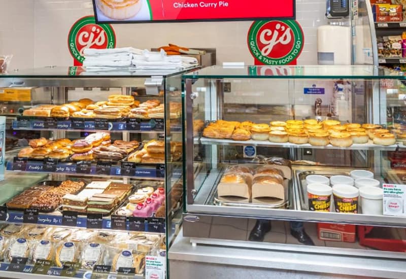
- Displays – Having the right displays for your products can make all the difference. We’re leaders in creating quality heated, chilled and ambient displays for grab-and-go food items. For customised display units you can rely on, take a look at our idesign range!
- Lighting – Getting the lighting just right is a great way to attract customers to a certain area of your shop or to show certain products in their best light. From LED strips to ground and wall lighting, it can be surprising just how effective it can be in attracting the right customer.
- Labelling – Promotional areas need to be highlighted and important information should be visible to further improve a customer’s experience. The quicker they can find everything they need, the more likely they will make a purchase.
Can we help with our customised displays and counters?
With our years of experience in the industry, we can help your small shop look the part with our displays and counters, customised to your requirements. For more information, chat to the Counterline team by calling 0151 548 2211.


